Apia Haus

A branding project rooted in craft, nature, and tradition. Apia Haus explores the relationship between bees, people, and the land.
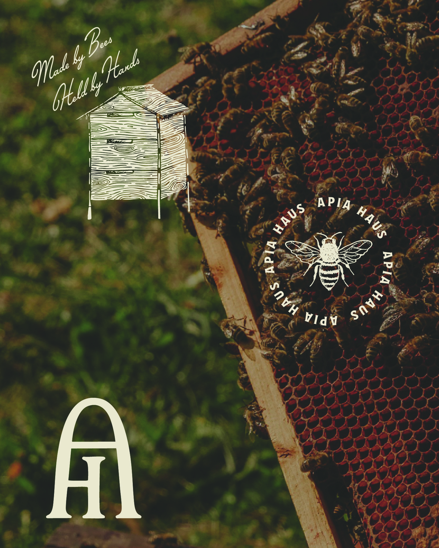
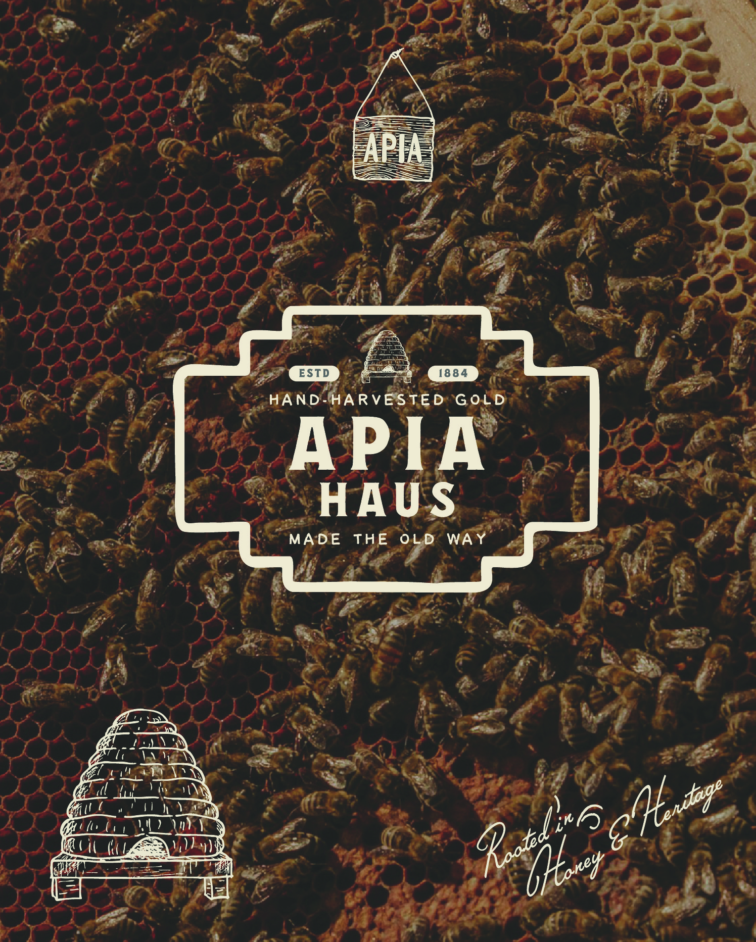
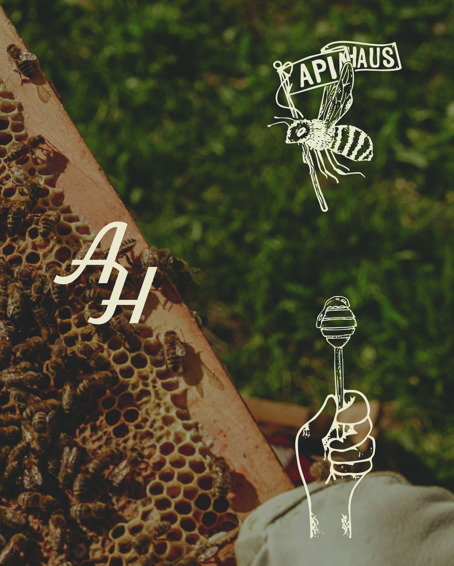
Handdrawn element for honey branding

(about the project)

Apia Haus is a branding project for a sustainable honey brand rooted in craft, heritage, and respect for nature. The name—derived from apis (bee) and haus (house)—reflects a community centered on care and the natural world.

Process
The identity was developed by hand, with illustrations and logotypes reflecting the authenticity of small-scale production. Rustic textures and natural tones emphasize its earthy character, supported by messaging rooted in craftsmanship and care.

Outcome
The result is an artisanal, enduring identity expressed through packaging and tactile details. The project positions Apia Haus as a brand grounded in sustainability, tradition, and mindful consumption.
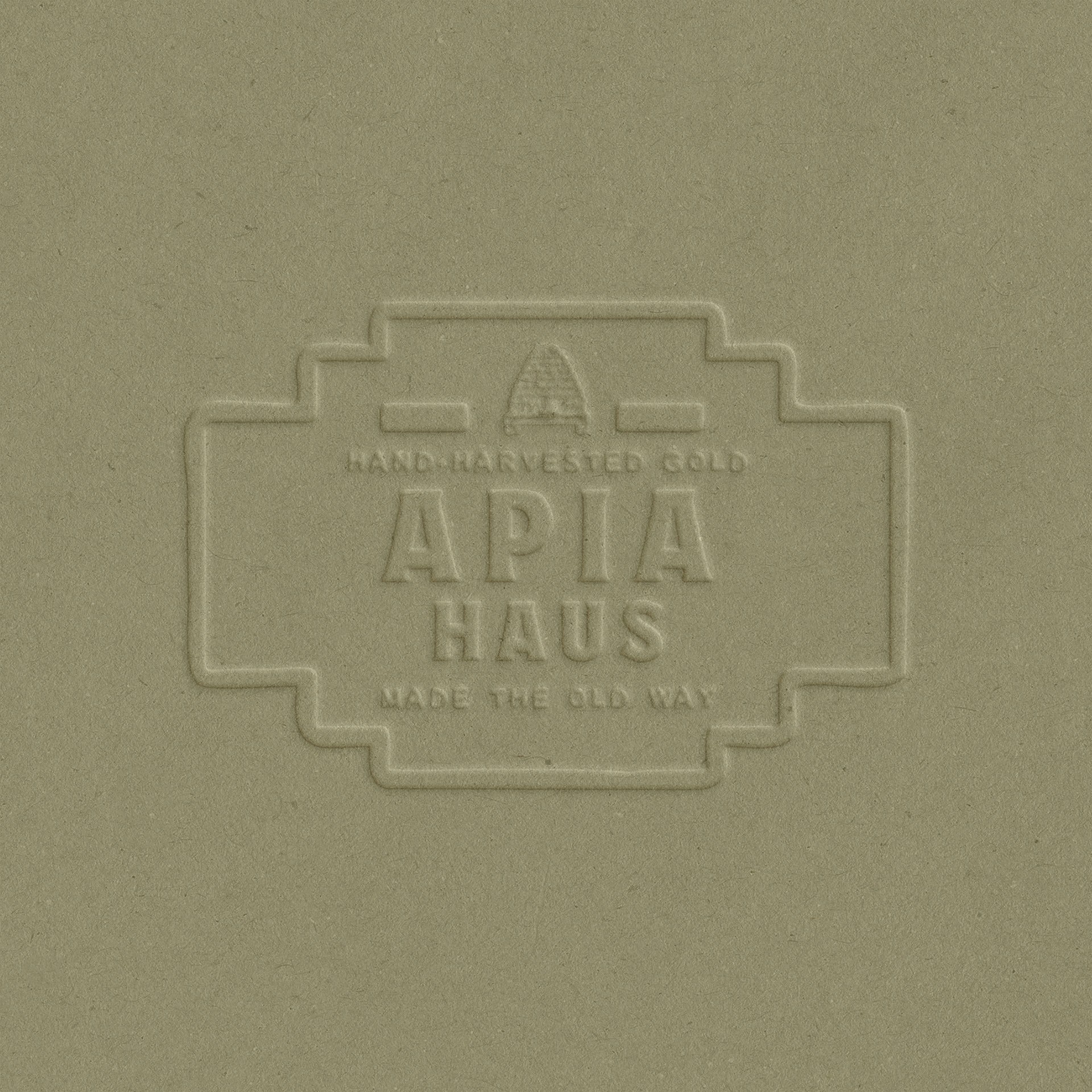
Logo on embossed green paper
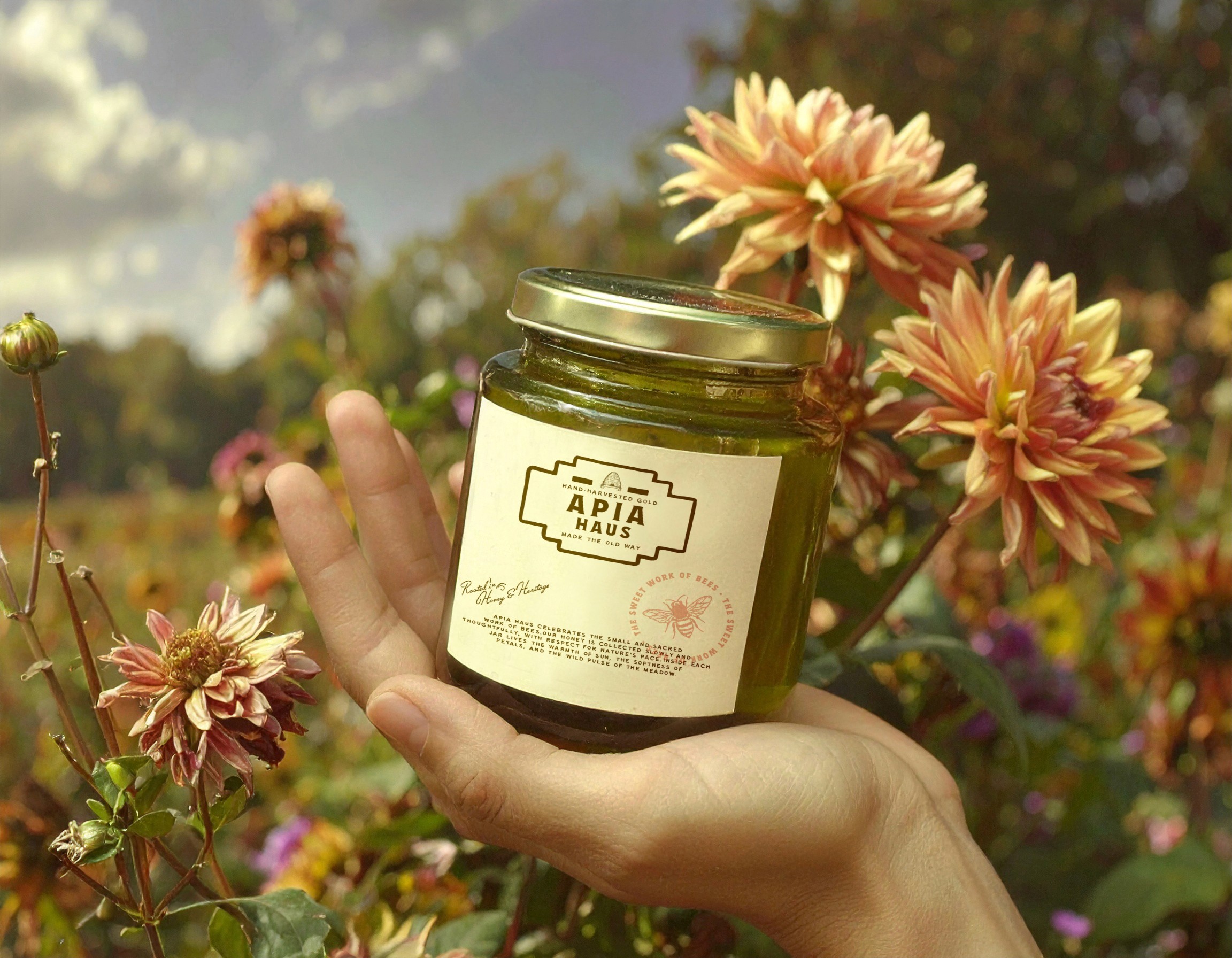
Honey jar in hand with flowers
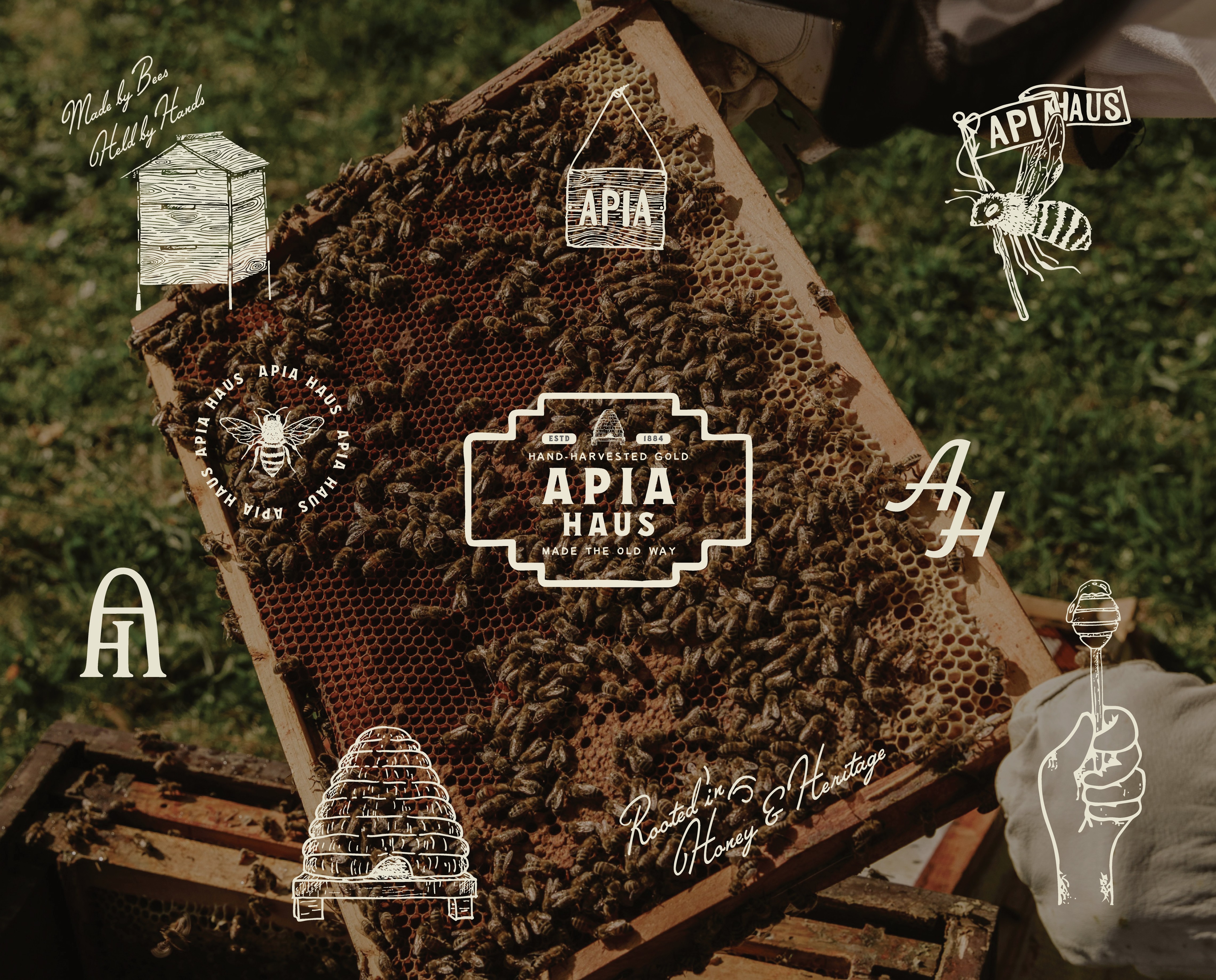
Honey branding with bees

(industry)

Artisanal Food & Beverage

(Date)

April 7, 2024

(client)

Passion project

(scope)

Visual Identity
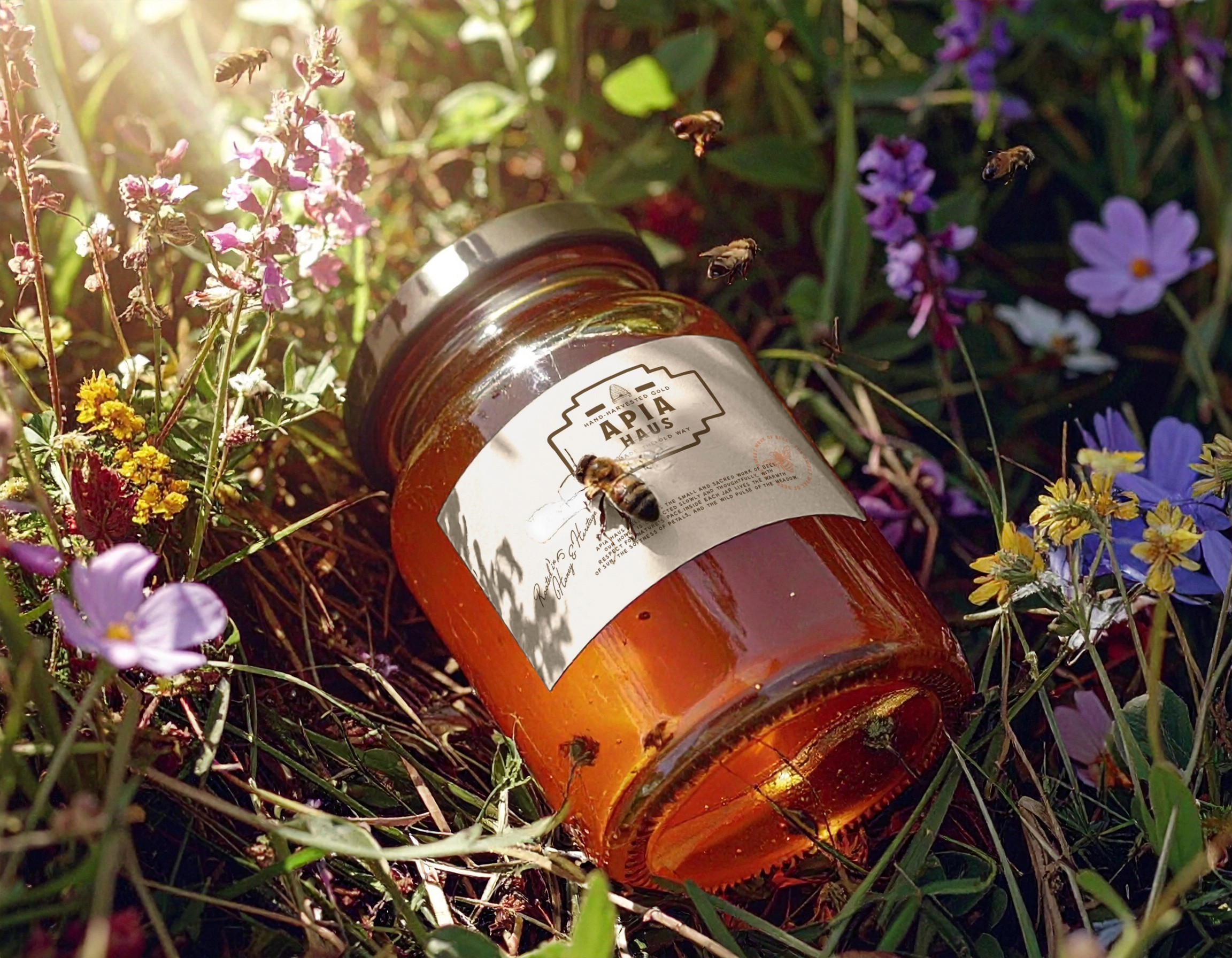
Honey jar in grass with flowers and a bee
Guys under stairs
Guys sitting on stairs

(next project)

A study of beauty standards and self-perception.

Start the
Conversation

From first sketch to final frame, I treat design as translation - turning ideas into systems that feel timeless. If thats the kind of work youre looking for, we should meet.

The Other Side

®

Start the
Conversation

From first sketch to final frame, I treat design as translation - turning ideas into systems that feel timeless. If thats the kind of work youre looking for, we should meet.

The Other Side

®

Start the
Conversation

From first sketch to final frame, I treat design as translation - turning ideas into systems that feel timeless. If thats the kind of work youre looking for, we should meet.

The Other Side

®