El Paraíso

A visual identity rooted in nature and Mediterranean culture
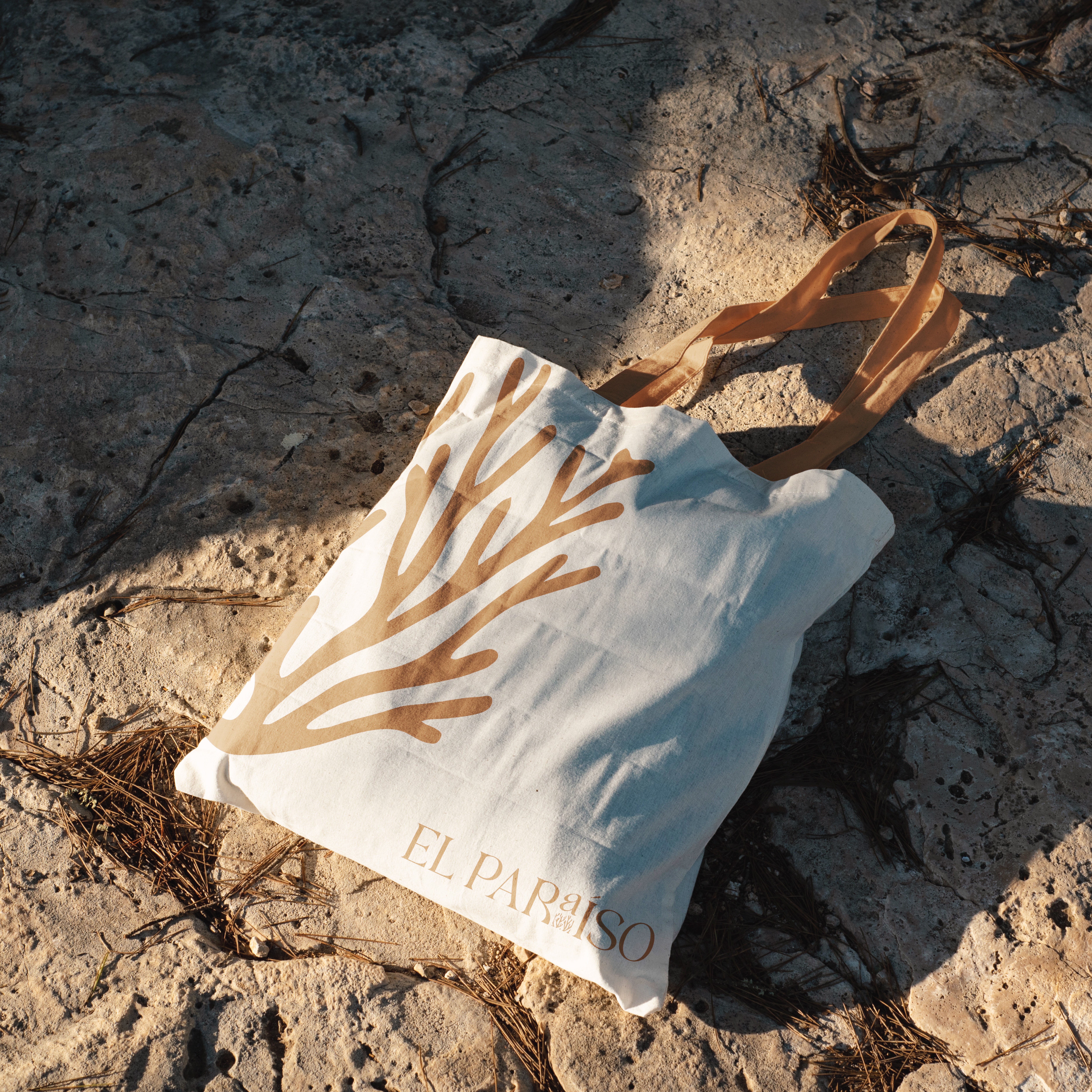
Tote bag on seaside rocks
Sky girl
3 people together

(about the project)

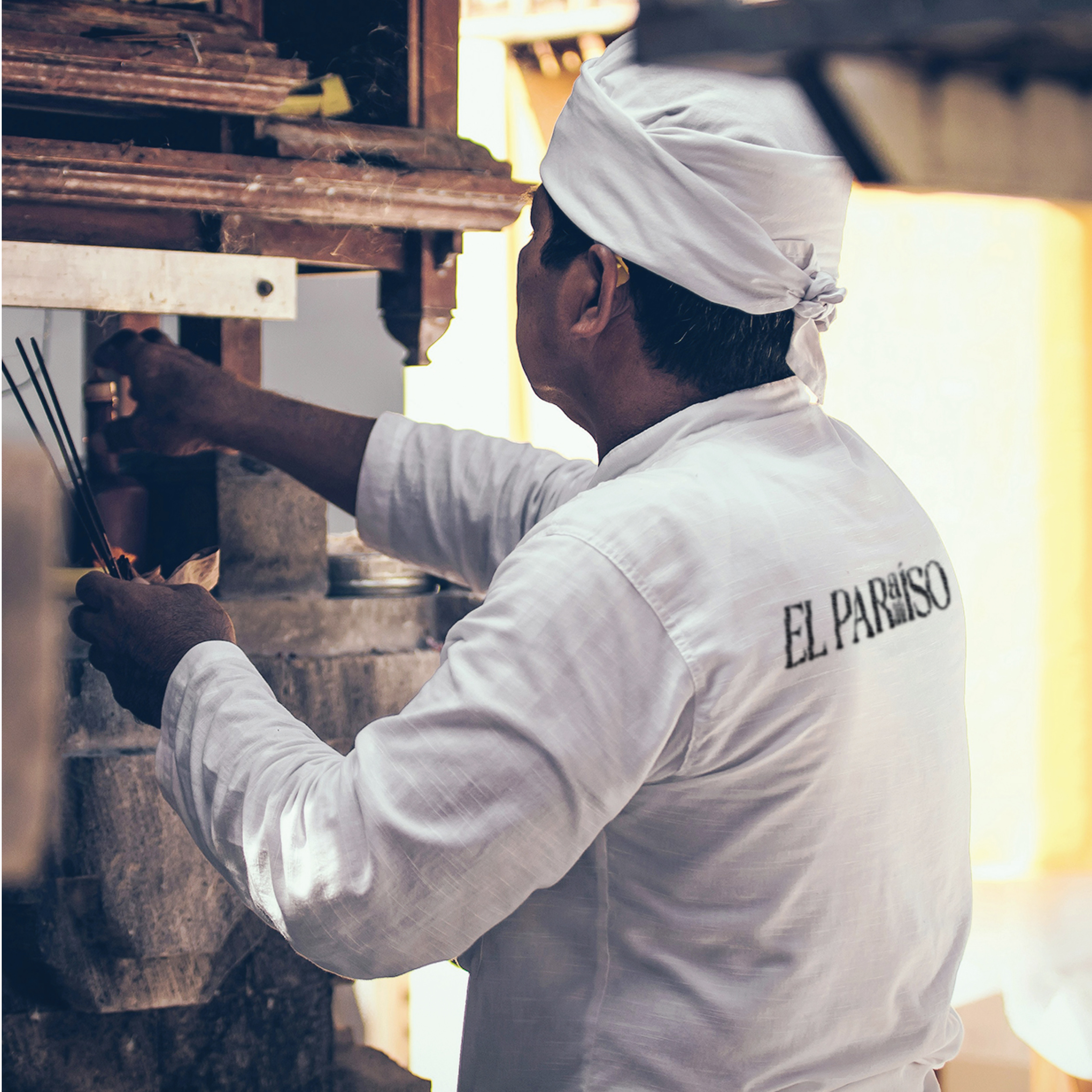
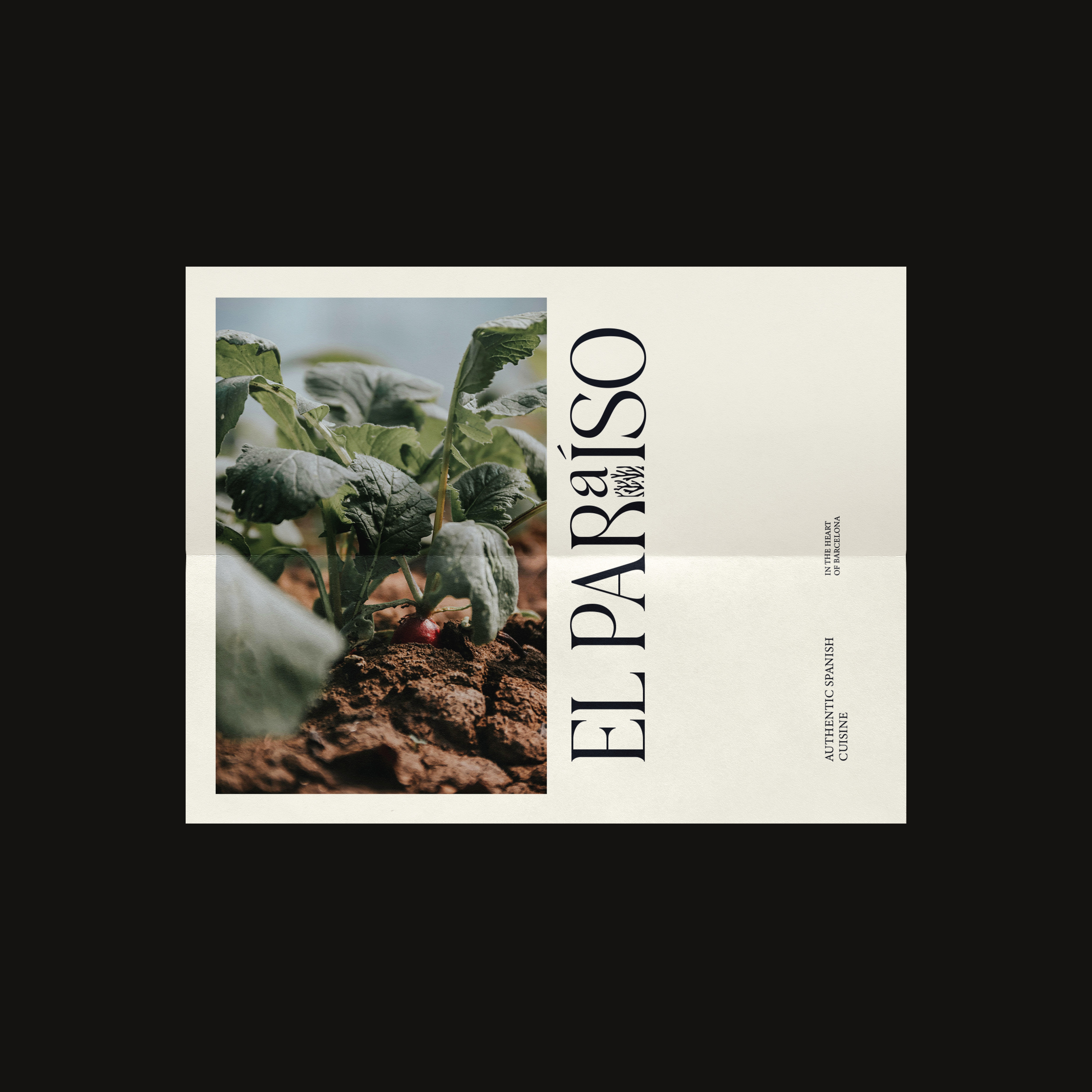
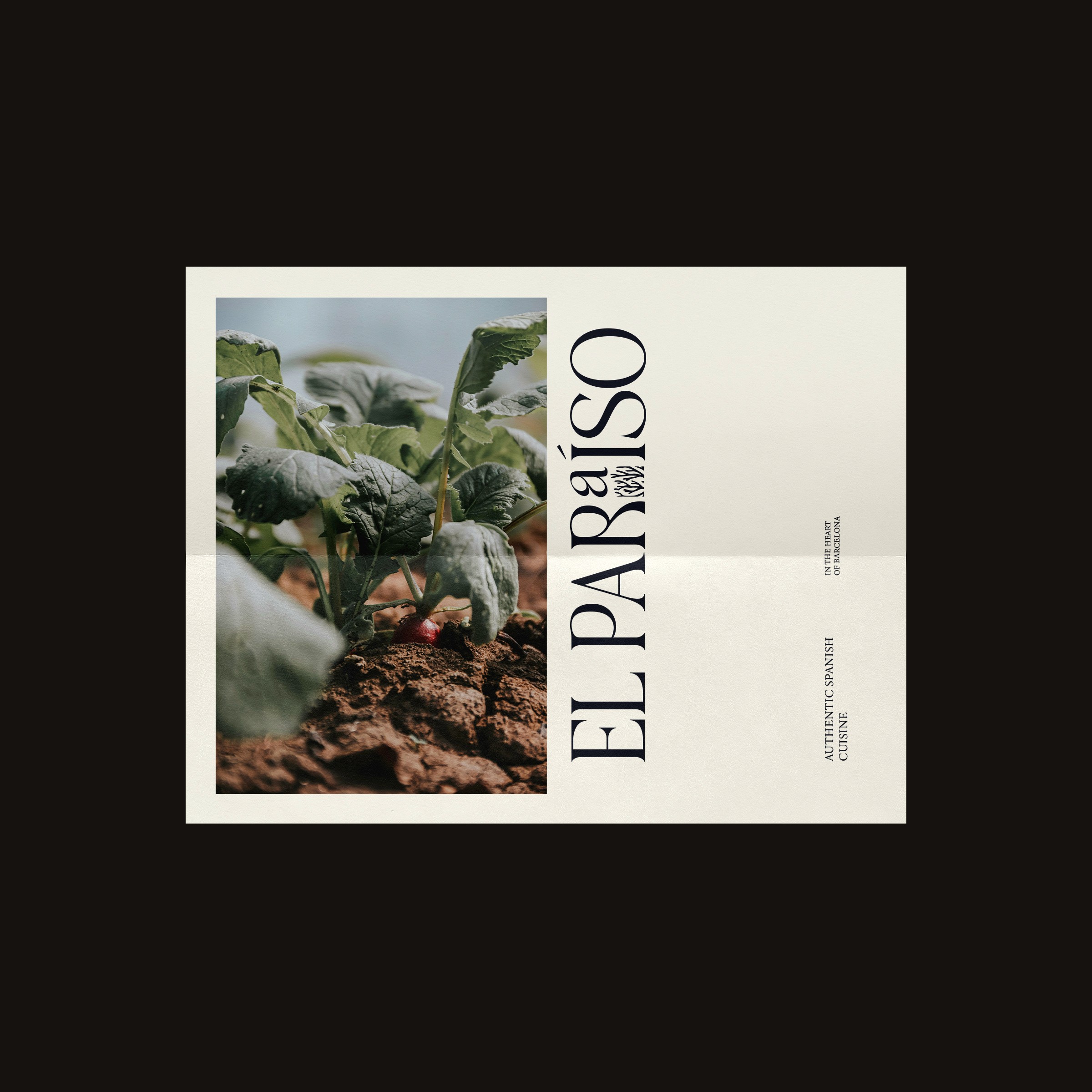
El Paraíso is a branding project for a Mediterranean restaurant rooted in organic farming and sustainability, reflecting a philosophy of freshness, authenticity, and food brought directly from soil to table.

Process
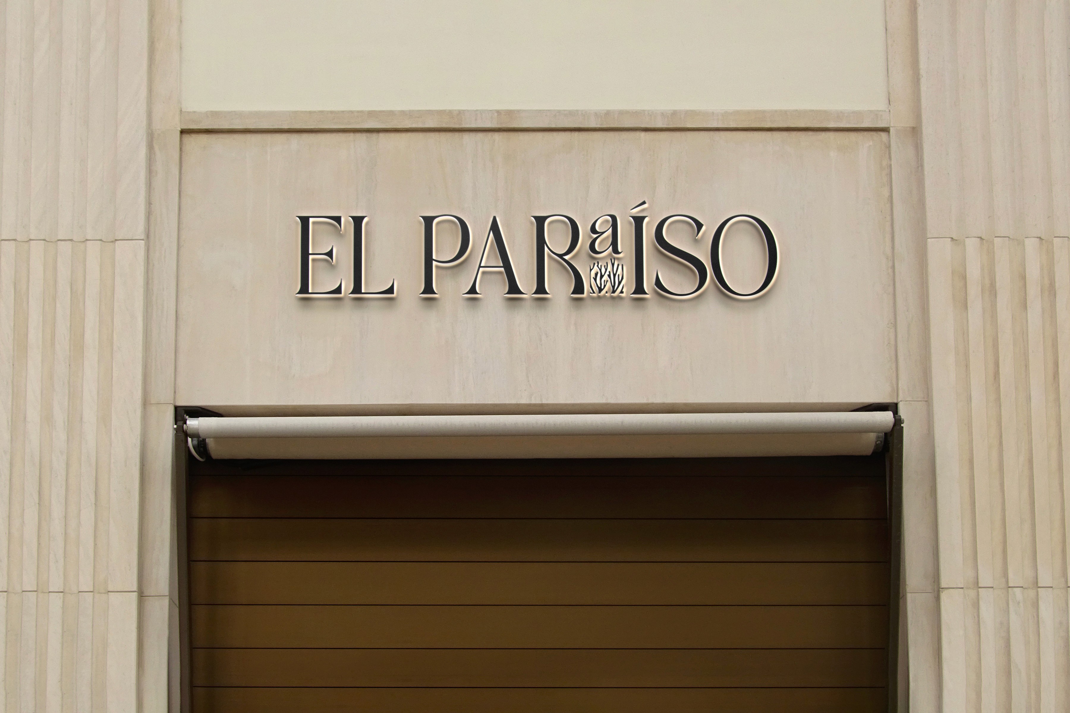
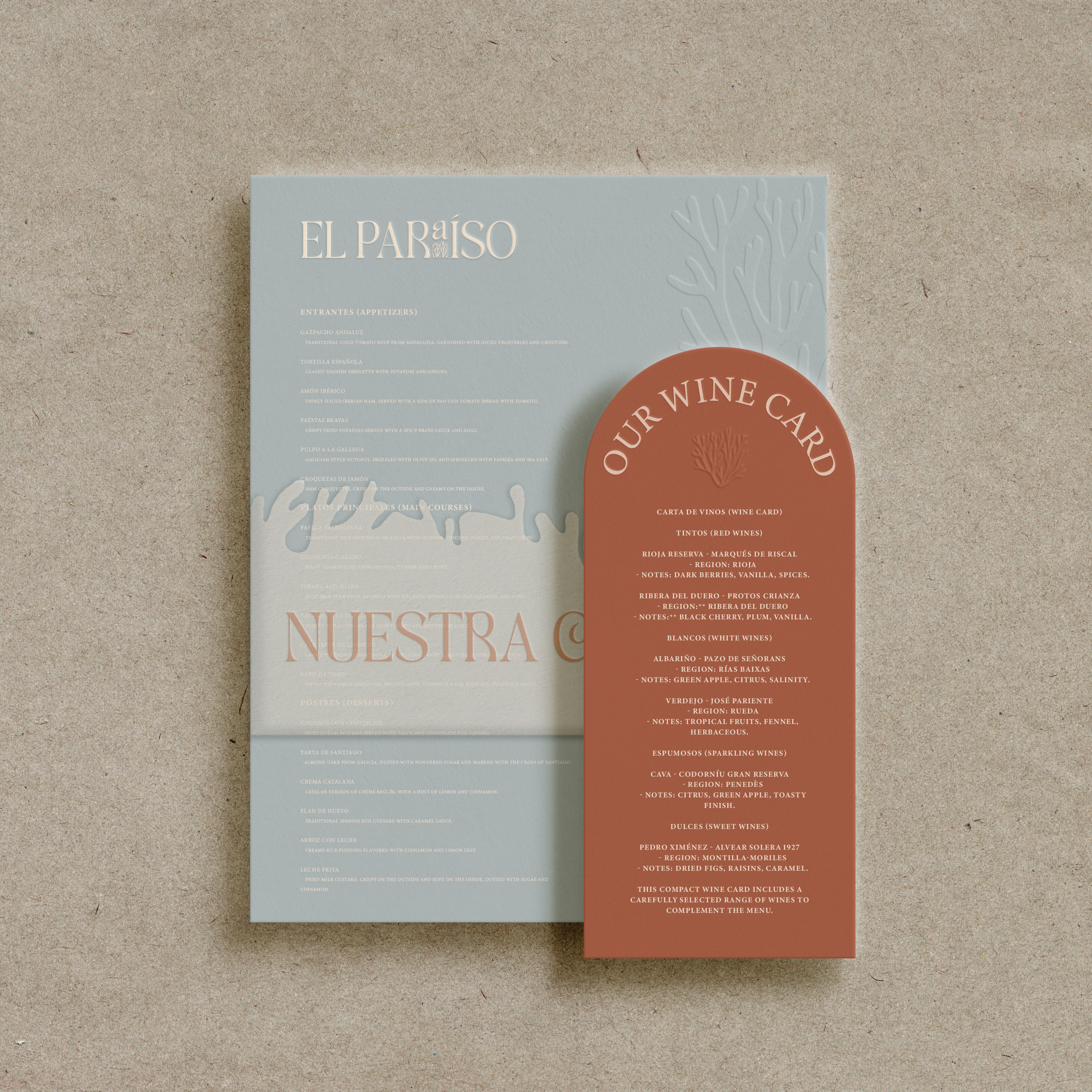
The visual language draws on textures of soil, stone, and sunlight, paired with refined typography to echo the dining experience. A coral detail beneath the A in the logo symbolizes the Mediterranean, connecting land and sea.

Outcome
The identity positions El Paraíso as more than a restaurant—an invitation to reconnect with the origins of food, celebrating harvesting, sharing, and care.
Orange girl
Girl having lunch

(industry)

Interior Design

(Date)

October 22, 2023

(client)

Independent Collective

(scope)

Brand Strategy, Visual Identity, Web Design

People playing

(next project)

A study in print and identity - Monohaus rethinks publishing as both a tactile and digital experience, guided by clarity and restraint.

Start the
Conversation

From first sketch to final frame, I treat design as translation - turning ideas into systems that feel timeless. If thats the kind of work youre looking for, we should meet.

The Other Side

®

Start the
Conversation

From first sketch to final frame, I treat design as translation - turning ideas into systems that feel timeless. If thats the kind of work youre looking for, we should meet.

The Other Side

®

Start the
Conversation

From first sketch to final frame, I treat design as translation - turning ideas into systems that feel timeless. If thats the kind of work youre looking for, we should meet.

The Other Side

®